FogBugz uses an algorithm called Evidence-Based Scheduling (EBS) to compute the probability that work for a milestone will be complete by any given date.
From the Reports menu, choose the project for which you want a report.
The report page has three sections.
In the top left, you'll see a table of all the upcoming milestones for this project, sorted by their official date. Drag the slider up and down to control which milestones should be included in the chart. For example, if you have a "beta" release, drag the slider to that release to show the beta ship dates.
In the top right, there is a slider listing priorities 1-7. Drag this slider up and down to control which priority cases should be included in the chart. You can use this to quickly see how the schedule is affected based on which priority features you implement. For example, if the ship dates EBS calculates are simply too late, you can quickly determine if you can finish on time by eliminating lower priority cases.
The chart at the bottom of the page has three tabs. It can show you six types of reports:
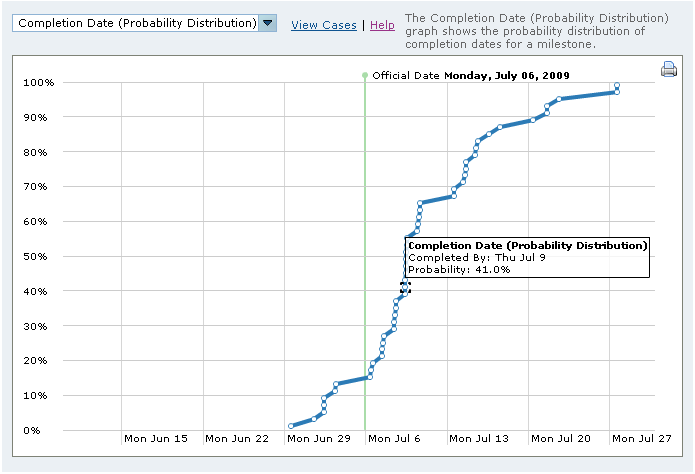
Completion Date (Probability Distribution)
This chart shows the probability that you will finish all estimated cases for any given date, for the milestones and priorities you selected above. The x-axis shows a ship date, while the y-axis shows the probability. You can move your mouse around the chart to examine numbers in detail.
It answers questions like:
Even though EBS doesn't perfectly predict the future, this chart is extremely useful in planning. You might discover, for example, that you only have a 3% chance of hitting the official date. When you have that information early, you can decide to cut features or change the official date before it's too late.
Observe the steepness of the chart.
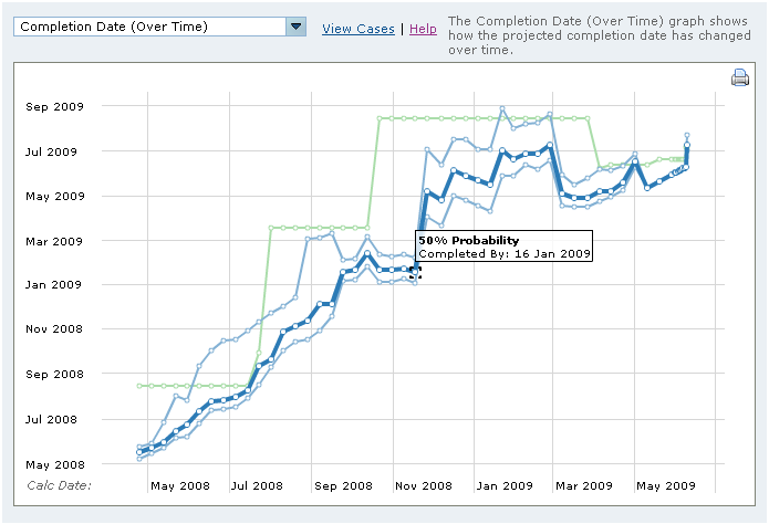
Compeletion Date (Over Time)
Every night, FogBugz stores a snapshot of the completion date's probability distribution for that day. This chart allows you to see how the estimated dates are changing from day to day. On the x-axis, it shows the date on which the calculation was done. On the y-axis, it shows the ship dates calculated on that date.
There are three lines. The lower line shows the 5% probability date (there was only a 5% chance of hitting that date); the middle line shows the 50% probability ship date, and the top line shows the 95% date.
It answers questions like:
Observe whether the chart is climbing, sinking, or flat.
Observe whether the three lines are converging (moving closer together).
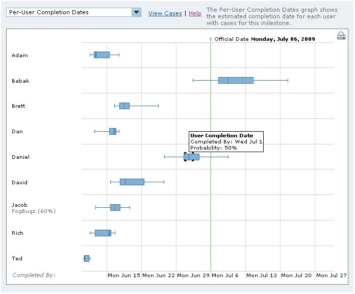
Per-User Completion Dates
The developer ship date chart can be used to see which team members have the most work on their plates and are in the critical path.
It answers questions like:
For each developer, you get a horizontal bar which shows five points: the developer's 5%, 25%, 50%, 75%, and 95% probability completion dates.
The further to the right a developer's bar appears, the later that developer will finish their work.
Observe whether the bar is wide or narrow. The widest bars reflect the developers who have the most uncertainty in their estimates.
In some cases, this may not matter. If Alice has a very wide bar, but she still has a 95% chance of finishing well before Bob, then Alice is not in the critical path, and her poor estimates cannot affect the schedule.
If it does matter, click on the developer's name to see that developer's estimate history, so you can see why EBS doesn't trust that developer's estimates.
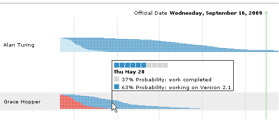
Per-User Timelines
The Per-User Timelines chart provides an accurate prediction of what each user will be working on at various points in the future, and how that can impact the overall schedule.
Each timeline "bar" is split up into sections that each represent a milestone. As you move along the bar to the right, you're moving forward in time. At each point, one or more milestone sections can overlap in the vertical direction. The more likely you are to be working on a particular milestone on a given date, the more vertical space that milestone's section will take up.
This visualization provides the most detailed prediction possible, and offers an instant visualization of the following:
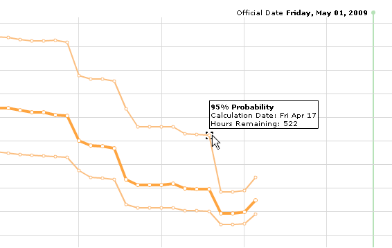
Burn-Down Chart
The Burn-Down Chart shows how the EBS-adjusted hours remaining for a milestone changes over time. As cases assigned to the milestone are resolved, these numbers will go down, and gradually generate a downward sloping line that "burns down" to zero. It's useful to track the 95%, 50%, and 5% probabiltiy lines, as see if they're tracking toward zero hours remaining by the time the official date rolls around.
Unlike the other EBS reports, this chart does not consider users' work schedules, or milestone dependencies. It provides a very basic, lower fidelity assessment of your project's progress without predicting a date.